Keeping it oh-so-simple
Where it all began
Founded in just 2011, McCartney has grown rapidly to become a thriving studio with some big name clients – Woolworths, Freedom and Mad Mex to name just a few. Founder Gary McCartney has a long and impressive track record in interior design, having created retail spaces of eye-watering beauty right across the globe. And having recently beefed up their team with a Graphics division (led fearlessly by Dean Hazelgrove) Gary wanted to review how the studio brand was defined.
What happened next
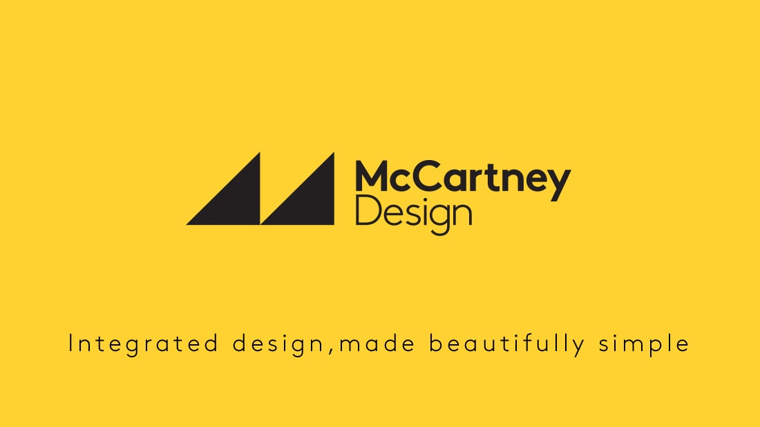
We ran a workshop with the folks at McCartney to define the studio’s strategic positioning and Tone of Voice style. Being a small-ish group, we were able to make this really collaborative and (dare I say) fun. After a bit of tearing hair out and good natured scrapping we distilled the brand voice down to three key qualities, and came up with a tagline that summed up what McCartney does: “Integrated design, made beautifully simple”.
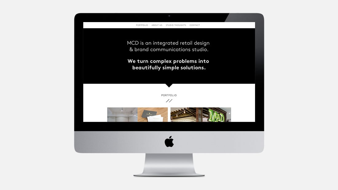
From here, we put together a Tone of Voice Guideline, and wrote up some website copy to complement all the gorgeous pics of McCartney’s work (check ‘em out, you’ve probably stepped inside a few of them yourself!).
What we like about it
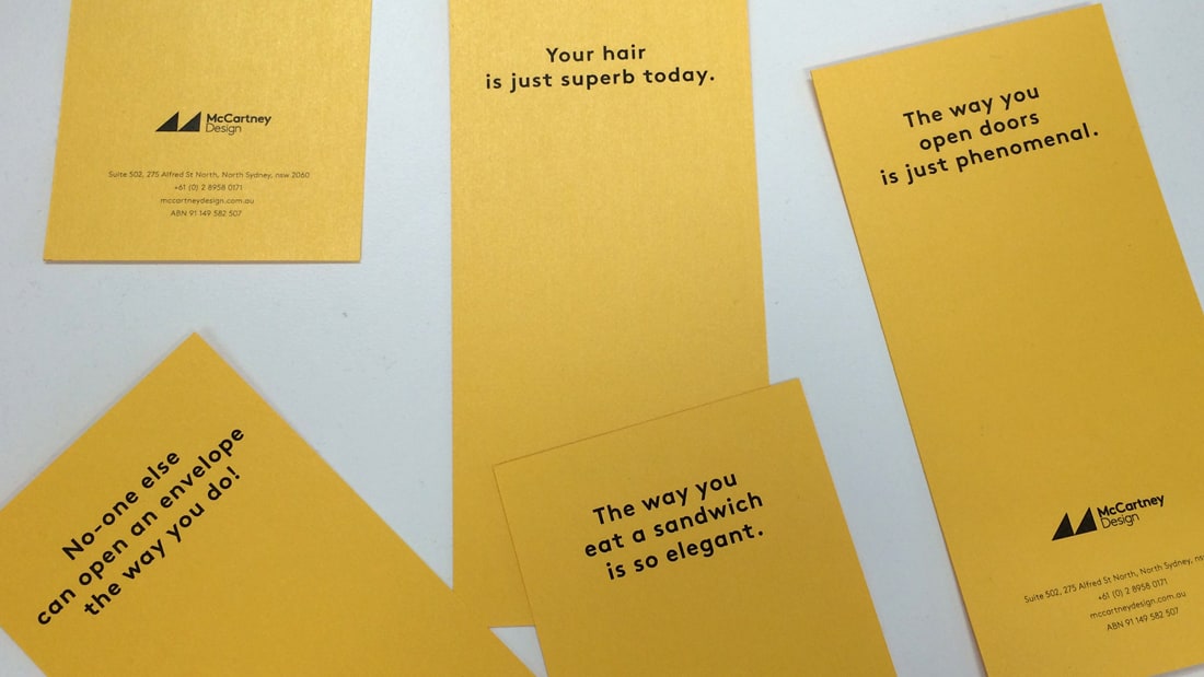
There’s so much same-sameness in how creative studios talk about themselves. While we still had boxes to tick (and words to include), McCartney were really open to adopting a slightly different tone of voice and avoid painful clichés. We are big fans of them, their lovely work, and their magnificent collection of accents.
